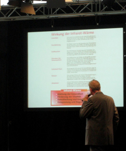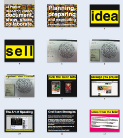
The common side-effects of a PowerPoint presentation — How often we’ve sat in a crowded classroom or a stuffy library as we lose brain cells by the slide and we struggle to keep our eyelids open. I’m sure medical labs across the country are testing PowerPoint as an effective use in curing insomnia. But in all sincerity, the term “Death by PowerPoint” is a serious matter and should not be taken lightly.
If I offend anybody with the below points, I’m sorry. But, we are a presentation design company, and we have the right to be nitpicky.
“Death by PowerPoint,” according to Wikipedia is a “criticism of slide-based presentations referring to a state of boredom and fatigue induced by information overload during presentations such as those created by the Microsoft application PowerPoint.”
This little sarcastic blog post is a short introduction to help those who read and care about their presentations, and how companies overload their slides with junk instead of knowledge.
5 Tips to Avoid Death by PowerPoint
Like all great presentations, PowerPoint should follow five simple guidelines.
1. Tell a story.
Picture yourself as Steve Jobs. Whether you’re an Apple or Microsoft fan, you cannot deny that Jobs is one of the best presenters in any industry. Bud Tribble called his method the “Reality Distortion Field”— Steve’s ability to get emotionally involved with an audience, utilizing his charisma and enthusiasm to sell a product, no matter how worthless it may be.
Once he’s made that connection (or rapport), the audience is in the palm of his hand. Jobs could probably convince me someday that an older model of the iPhone is worth $300 because it’s an “antique.” Well, maybe.
Recently I went to a conference about stock investments. I remember one speaker really had me hooked because he told a story about how his son spent countless nights reading stock reports and invested roughly $2,000. That money has now quadrupled. I wanted to go back to the hotel, pull up my bank account, and invest. The story was nothing remarkable. But it was enticing because of the possibilities it created.
Remember, tell a story and build up the emotional connection. First impressions count.
2. Cut the crap with hundreds of slide animations.
Imagine making your audience sit through the above slide with everything flying in. Seriously. What is wrong with you? A couple of bullet point entries is cute, and a couple of slide transitions is fine, but having them each slide? Unless you have a good, specific reason (such as, this is a PowerPoint purely on slide animations), then don’t do it.
Think about it this way: Every animation or different transition dilutes the audience’s attention more, and more, and more, and more (you get the drift). Keep animation to a minimum, and try not to use more than 2-3 different slide transitions.
3. Keep the text simple.
The longer you use ridiculous fonts, the more you lose an audience’s attention, and their respect. What’s even worse? When you read word for word on the PowerPoint presentation. What happens if I took that slide away from you? Would you even know what’s on it?
Too many bullet points will always lose an audience. Slides with the least amount of text always do the best job. Give the audience a sheet of paper detailing the presentation if you have that much too share. But remember, can you really tell a story by using only bullet points?
4. Use color wisely.
Ouch. At least try to show them you care. Don’t give them a horrible color eyesore that makes everything look the same. Does this even look intelligible? By blending in colors properly, you can make text stand out, and make your presentation appear more professional, unique, and visually appealing (not like you took a gallon of virtual paint and spread it across your PowerPoint canvas as if you were sloppily spreading butter across bread).
5. Charts and diagrams please!
Personally, I find PowerPoint one of the best presentation tools to use graphs and charts. However, most people don’t bother with the bars and graphs. So please start! PowerPoint is a media-driven, visual tool — not a dissertation.
PowerPoint already comes equipped with custom pie graphs and charts, with the rest being up to you. Please keep the charts simple though, as we don’t want to see “The growth of 40 different companies in the last 10 years” on one slide. That’s overwhelming and complicated. Keep it as simple as possible.
In conclusion
By the end of this blog you should be able to grasp a little more information on how to use PowerPoint. If not, here are links to great presentations that you can use as references.
How to Make Big Things Happen with a Small Team by Jason Fried, 37 Signals
A Storied Career (great for storytelling)
Please stop audience cruelty by using a trite, unprofessional PowerPoint presentation. They came to you for knowledge, yet you provide pain and boredom. I hope this post can give you some understanding on the fear that is out there. On that note, I leave you with my blessing, now that you survived this 900+ word blog post. And, if you heed this advice, you will be good to go!
Photo by alice_c via Flickr.


Kudos to WorkAwesome for featuring our blog. We would love to hear your thoughts on presentations tips that work for you for future blogs.
Please send us your answers, questions, or feedback at hq@bigfishpresentations.com 🙂
I cannot tell you how many horrible Power Point Presentations I have had to sit through. In many cases, their entire point was lost because I was either so bored, so confused, or busy making fun of the constant pictures and sound effects. Great article!
Second part of the third point, too should be to.
6. Use the correct wording. 😛
Otherwise, great post!
HI John,
I don’t know what you’re pointing at, but to me all looks good!
Thanks for reading WorkAwesome. 😉
–
Pooja
Editor
I would add to the list couple of Steve Jobs presentations. Especially that one where he introduces iPod for the first time. Excellent example of making an impact and not killing people with PowerPoint. 🙂
think my teacher needs to read this.